Chicago Beefs Menu Design (AD 318)
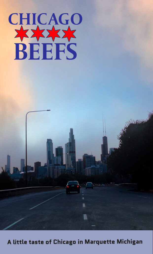
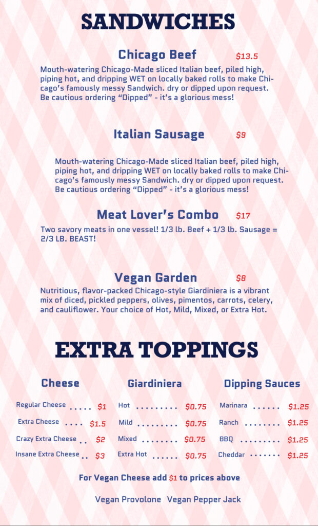
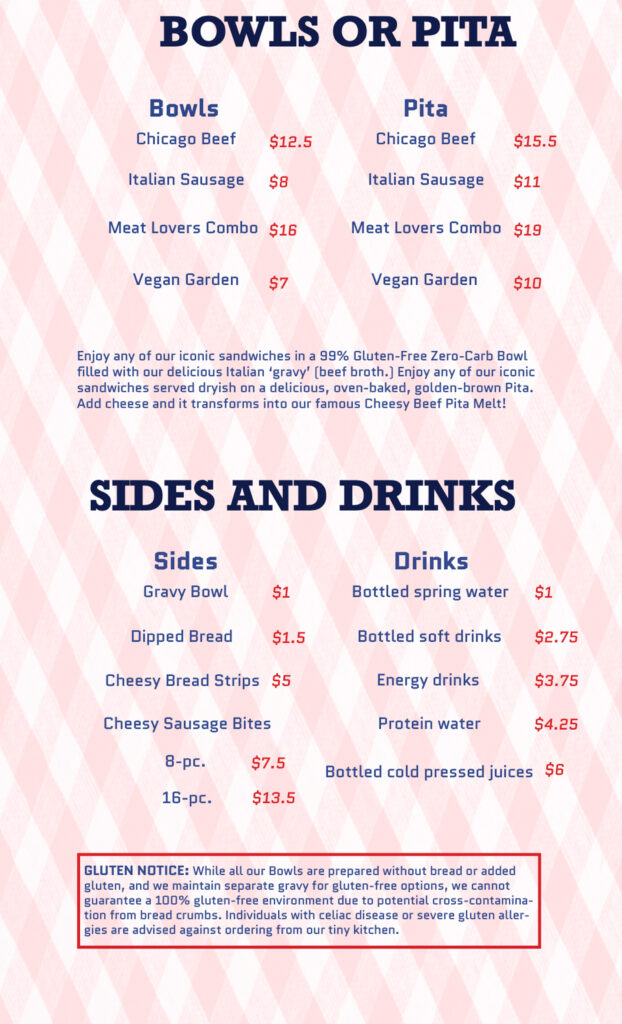
This project called for the redesign of an existing restaurant menu. Having worked in a small Houghton based sandwich shop called Chicago Beefs, I collaborated with the owner to create an improved design that incorporated hierarchy, minimal typography, and white space, making it both visually engaging and easy to read. A color palette of blue and red text, as well as a red and white tablecloth background texture connects the Chicago Beefs identity to those of the iconic sandwich shops of Chicago. To further this connection, I used photographs of Chicago from my portfolio and placed them on the front and back of the menu and added a brief note on the history of the sandwich, reinforcing the cultural identity of the food.